When optimising your site for mobile, sometimes you need margins that only apply at certain screen sizes.
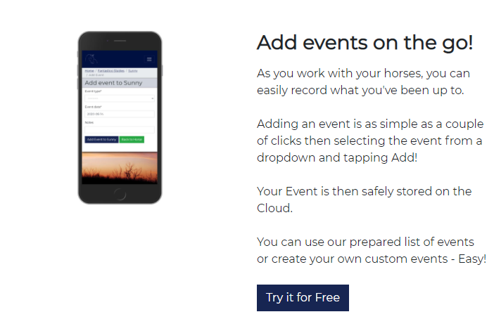
For example I have this on the desktop size of my website HorseRecords:
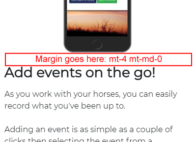
And on mobile it goes to this:
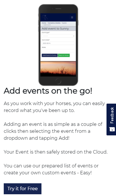
There is no enough space between the image and the title for my liking. So let’s add some space!
The code is:
    <div class="row mb-3 pb-3 border-bottom">
        <div class="col-md-6 ">
            <img src="{% static 'images/mobile_add_events.jpg' %}" class="img-fluid mb- mb-md-0" >
        </div>
        <div class="col-md-6 my-auto ">

            <h3 class="mb-3 mt-4 mt-md-0"><b>Add events on the go!</b></h2>
            <p>As you work with your horses, you can easily record what you've been up to.<br>
            <br>
            Adding an event is as simple as a couple of clicks then selecting the event from
            a dropdown and tapping Add!<br>
            <br>Your Event is then safely stored on the Cloud.<br>
            <br>
            You can use our prepared list of events or create your own custom events - Easy!<br>
            <br>
            <a href="{% url 'website:pricing' %}" class="btn btn-primary no-underline">Try it for Free</a>
            </p>
        </div>
    </div>
The trick is to add these bootstrap classes mt-4 mt-md-0 to add a margin to the header element only on mobile:
<h3 class="mb-3 mt-4 mt-md-0"><b>Add events on the go!</b></h2>And then you get the much nicer looking:
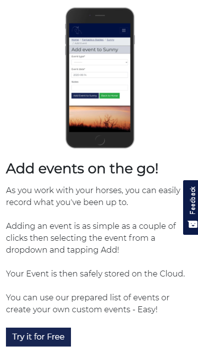
Lets look at mt-4 mt-md-0
The mt-4 means “give this element a margin top of 4”
The mt-md-0 means “give a margin of 0 to all screen sizes medium and above”